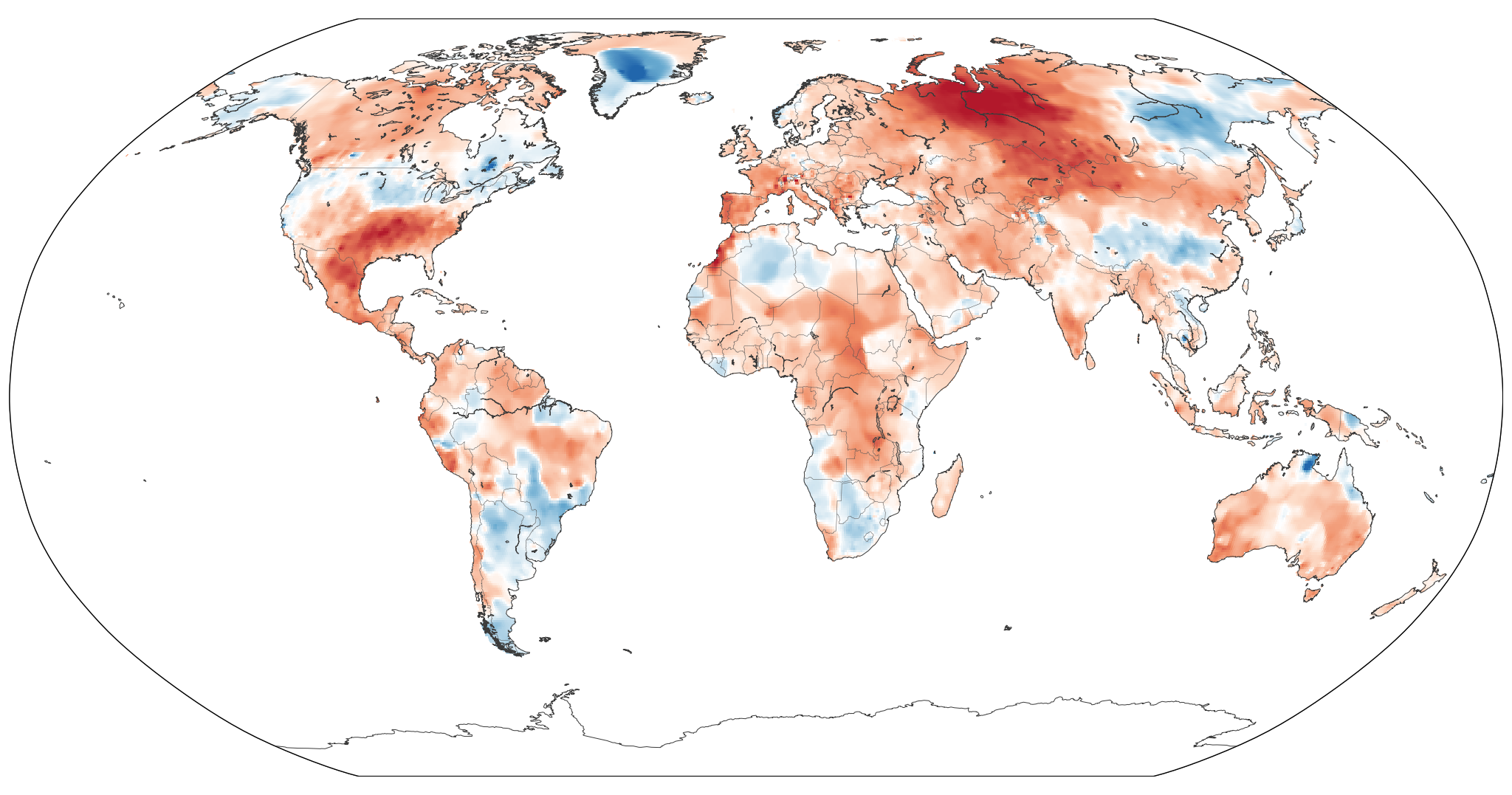
Move over a region to identify it. Click or tap to enlarge.
What this shows. For each area on the map, each day’s maximum temperature is compared with the normal maximum temperature for that same date, based on the 1991–2020 average. The map shows the average of those daily departures over this 14-day period. Red shows where maximum temperatures were warmer than normal; blue shows where they were cooler.
Why 14 days? Averaging over 14 days reduces the effect of short-term weather and makes persistent temperature patterns easier to see. It also means that individual days may have been considerably hotter than the 14-day average shown here.
Data: NOAA Climate Prediction Center (CPC) Global Temperature, 0.5° daily maximum-temperature grid and 1991–2020 daily maximum-temperature climatology.